
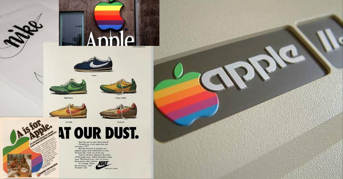
Minimalism and Brand Equity often go hand-in-hand, not because all great brands are minimalistic, but because these brands have earned the right to display their brand mark without their brand name. Here’s how Apple & Nike earned that right.
1976: The Original Apple Logo
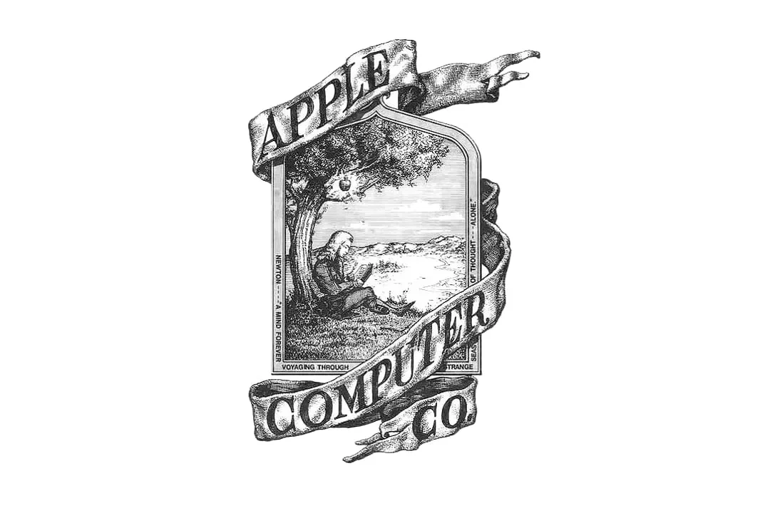
The story of this famous logo begins here, in 1976, not with the sleek, minimalistic apple we recongise today, but with a complex illustration. The first logo, created by co-founder Ronald Wayne, depicted Isaac Newton sitting under an apple tree.
It looks nothing like how it looks today, and fourtantely Steve Jobs and Steve Wozniak realised the need for something more scaleable, impactful, and most importatnely, distictively Apple.
Peoppe needed to think Apple = Macinotsh Computer, not Isaac Newton.
(side note, this looks like it would make a delicious logo for some sort of Apple Juice!)
1977: The Apple Appears
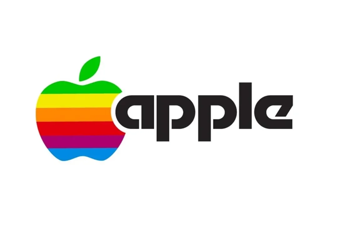
According to Steve Jobs, the reason behind the apple was due to simplicity an apple represents.
‘But the main idea behind Apple is to bring simplicity to the public in the most sophisticated way possible, and that’s it, nothing else’.
This is where the truly distinctive logo begun. But here’s the important thing, it still holds the brand name, and it is highly visible. Jobs and the creative team knew the brand equity hadn’t been built yet, so people still needed to understand who was behind the apple.
1984: The Apple Alone
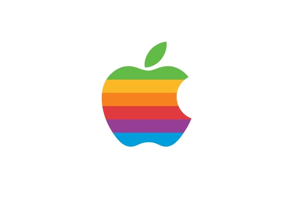
After 8 years since the last logo revamp, the logo was slightly tweaked, notably dropping the brand name, and letting the apple live on it’s own, and carve out it’s own meaning.
By this time, Apple had begun to create large-scale awareness and brand equity, through it’s powerful Macintosh computers.
The iconic colours were still kept, so the correlation between the coloured logo with the brand name and the version without were still strong.
1998: Monochromatic Apple
14 years later, the colour was dropped, and the monochromatic, minimalist logo was introduced.
Steve Jobs had returned to the company by this time, and marked Apple’s commitment to technology and innovation by making the logo appear more sleeker to represent the groundbreaking advances they were making.
The monochromatic version was reflective of the companies vision: simplicity, elegance and cutting-edge technology.
Apple’s brand identity reflected it’s vision, but was highly distinctive and fed off years of brand equity and exposure.
2017 - Current: Minimalist, Distinctive, Instantly Recognisable
And over 50 years since the original apple brandmark was introduced, it’s so highly distinctive, memorable, and has built such strong brand equity, that it can exist as a minimalist asset on it’s own, and people will always recognise it, anywhere in the world.
The lesson here is that the strongest brands are built over a long period of time, with committment to the vision of the business, but also commitment to the identity of the brand. They barely changed the original scope of that second logo variation, and it has no doubt held the test of time.
Apple can now be minimalist because they built brand equity, built a highly distinctive asset, and reflect the mission of the company.
Nike:
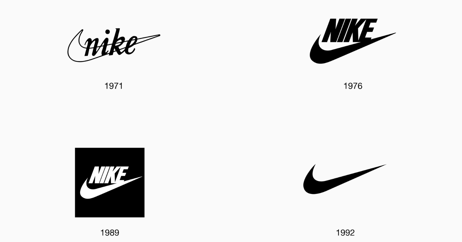
1971: The Original
In 1971, Phil Knight was running Blue Ribbon Sports, a small Oregon company importing Onitsuka Tiger running shoes for American distance runners. He needed to break from Onitsuka, launch his own brand, and have a mark ready quickly and cheaply. This was Nike.
Knight taught accounting part-time at Portland State University. One of his students, Carolyn Davidson, was a graphic design student at the same institution. He hired her at $2 an hour.
Davidson showed a single-stroke mark she later described as “looking like a wing”. Knight’s recorded response: “I don’t love it, but maybe it’ll grow on me.”
Little did Davidson know that her design would become one of the most popular visual identities in the world.
Like Apple, this logo begun with the brand name very visible, beginning to build the brand correlation between the famous swoosh and the Nike name.
1976: Steps toward distinctiveness
Five years later, there were a couple updates. Firstly, in the slow evolution to true minimalism, the brand typography was updated all caps Futura Bold, and positioned the brand name above and around the swoosh, slowly starting to break the two apart whilst still upholding the swoosh > Nike brand name correlation.
Additionally, the swoosh was filled in, signalling the continued evolution of tech, professionalism, and of course, being a distinctive, minimalist asset.
1992 - Present: The SWOOSH alone
The brand had finally built enough equity that the name could be dropped, and the logo live on it’s own. It was, and still is, so highly distinctive that Nike is the instant thought.
This, like Apple, is how long-term brand building truly works. These brands didn’t just appear out of thin air with instantly recognisable logos, and they certainly wouldn’t have initially succeed and became memorable if they didn’t include a brand name at the beginning of their journey.
Building strong brands and distinctive assets takes time. Brand equity and minimalism is earnt, not given.
If you’re looking to build a strong, distinctive brand, we’re here to help. From concept to design, to execution and brand equity building, Reel Social + Strategy in Albury Wodonga are experts.
Enquire Below:
